

Unless some seismic shifts in behavior and policy take place over the next four years, we've got no chance of limiting global warming to the 1.5 °C target put on record by the Paris Agreement in 2015.
Anything higher than that, and all the consequences of climate change get much worse: oceans rising higher, weather systems collapsing, more parts of the world becoming inhospitable, and extreme events like hurricanes and wildfires becoming even more common.
While we know that with enough work and political will, humanity can plot its way out of the worst-case scenario, a lot of change needs to happen very fast.
To give us all a better idea of what lies ahead, the IPCC has also launched a super-detailed, interactive map, breaking down possible climate change scenarios across the globe. You can zoom right into your part of the planet and see what's likely to change before the end of the century.
Whether you want to look up the rainfall over Africa, the top temperatures in the Arctic, or the sea level rise around Australia in the years to come, this atlas can help. There's a wealth of data to look through, all presented in a clear and easy-to-read way.
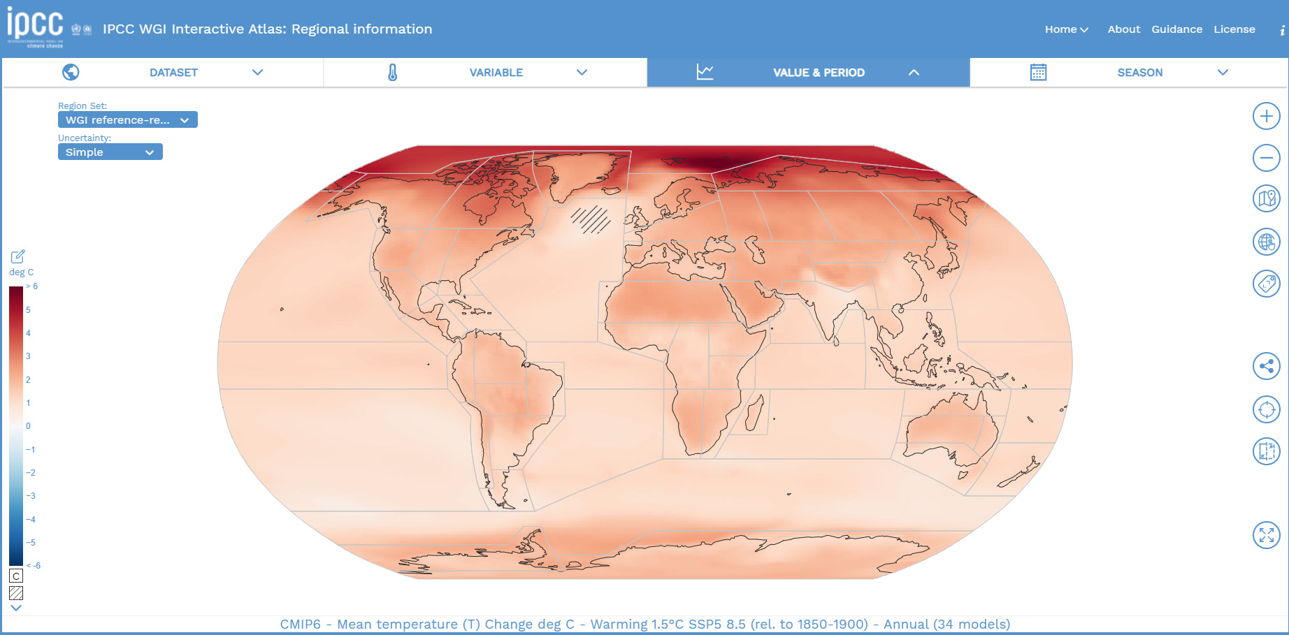
You should see a tutorial when you open the map up for the first time, but in general if you just click around the atlas, it won't take you long to figure out how it works.
 (IPCC)
Under Dataset you can pick from a variety of the best climate models, including the latest and most detailed, CMIP6. The Variable menu is where you set what you want to look at (temperature, precipitation, and so on), and under Value & Period you can switch between spans of years and predicted scenarios (such as 3 °C or 4 °C of warming).
As well as checking out what's going to happen in the future, you're able to dip into the recent past too, to check how the statistics compare. Plus, besides checking your own particular area, you can also narrow down the results by the time of year as well.
The team behind the atlas has gone to great lengths to be as comprehensive as possible: When you bring up various graphs and forecasts, the areas of uncertainty are clearly marked, with more definite predictions in darker colors.
All the data that's displayed can be downloaded and shared as well – perfect for getting your neighbors and relatives up to speed on where the planet is headed.
If we're going to head off the worst of climate change, we're going to need all the data we can get, and this map brings a wealth of it right to your fingertips.
You can peruse the IPCC interactive atlas here.
Post a Comment